


Want to build an enterprise-level product your users truly love?
When designing for a product flow, designers tend to picture the ideal one first. Consider a music app like Spotify: the user pulls out their phone, opens the app, navigates to the playlist, hits play, and the music swells right on cue. What a flawless journey without any interruption!
Unfortunately, in the real world, unpredictable interruptions happen all the time. While we're searching for a song, a phone call or any other interruption can suddenly barge in and pull us right out of the flow. Should the search result be kept after the user leaves? How long should it be kept? What are these design decisions based on? How a product handles these questions is what separates a well-designed one from the rest.
In this article, we'll look at how designers help users get back into the flow effortlessly when external interruptions inevitably occur, and how these subtle design details contribute to an enterprise-grade product.
Design for the Resume
When returning from an unexpected interruption, a user's mind is all about getting back easily, so the design should give them enough context to recall where they were and pick up right where they left off. The most common solution is to preserve the state. But preservation doesn't mean freezing every details on the interface. It has layers. And what to keep or not comes down to whether the information is enough for users to reconstruct where they were before.
Let's go back to the Spotify example. After a phone call, we'd definitely want the app to keep the keyword we typed in the search bar, rather than just dropping us back to an empty search page. But now consider a different scenario: a user is browsing a list on a shopping site and hovers over an item, triggering a quick preview for the details. If they get interrupted and come back, does the experience need to restore that quick preview as well? Probably not. The difference is that the search keyword is a critical anchor point in the search flow, while the hover quick preview is just a brief detour off the browsing flow. So if a piece of information anchors users' mental context, and users struggle to reconstruct it on their own, it will be the perfect candidate to preserve. If it's not? Just let it fade away.
Not All Interruptions Are Equal
How to apply preservation design is also tied to the length of the interruption. That means categorizing interruptions by duration and designing for each is a necessary step. However, the time-scale isn't universal. In a flight booking app, search results have to be reset every 10 minutes. But in a productivity tool like Google Docs, users will find everything exactly as they left it, even after being away for a full day.
That means the preservation decision is also driven by how valuable the information is. Within the same flow, lower-value information only needs to survive short interruptions, while higher-value information should persist across both short and long ones. In other words, the more valuable the information, the longer it deserves to stay.
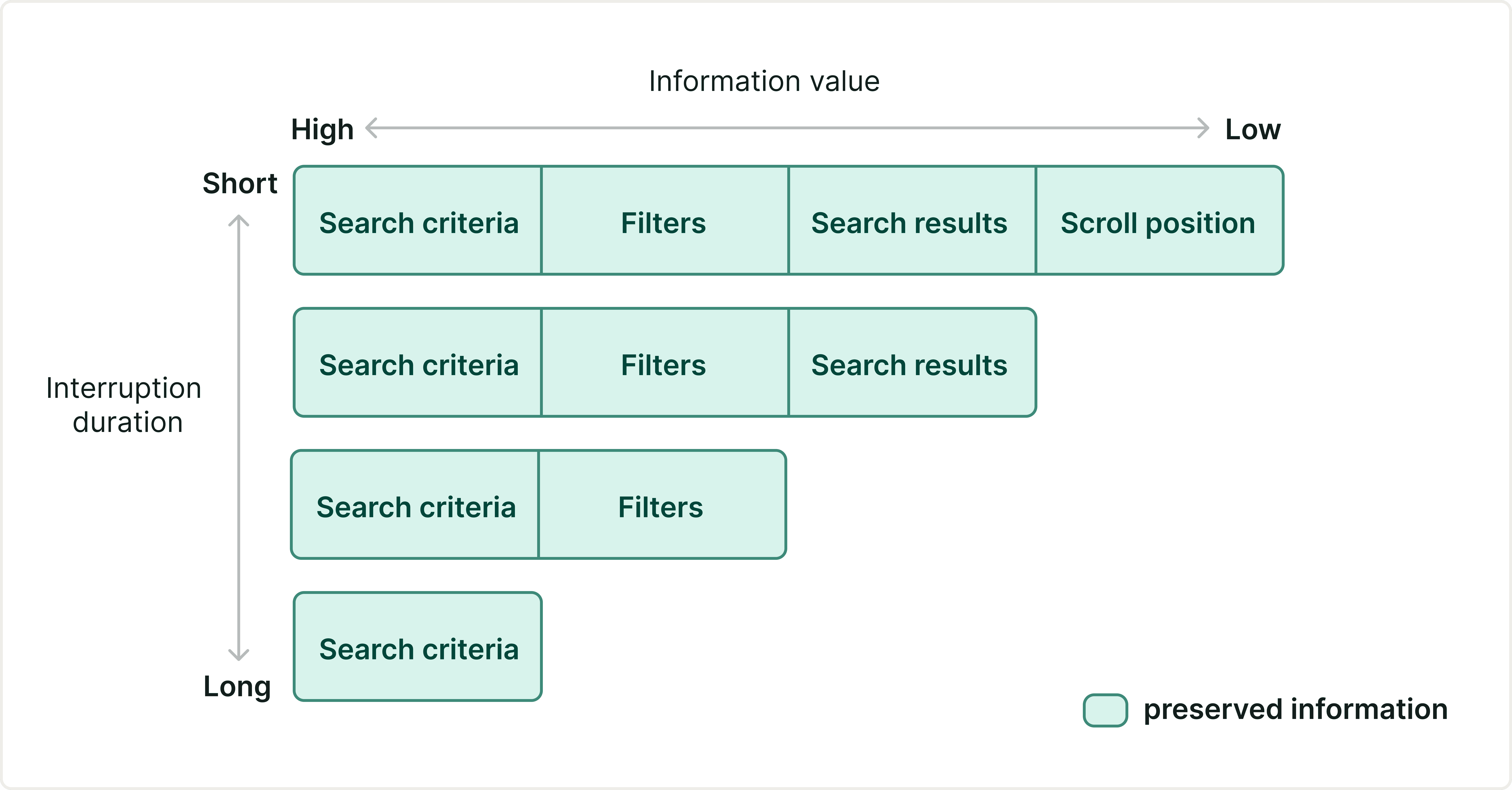
For a flight booking app, the preserved information will decay as the interruption duration gets longer.
Design for the Shared Resume
So far, we've been talking about designing for individuals returning to a single-user flow. But what about collaborative flows? When state change is inevitable, does simply keeping information on the interface still work? Well, the answer is more nuanced. Recovery design for collaborative flows is not only about state preservation, but also about the visibility of change. But when users return, we don't want to overwhelm them with every single change, but we still want them to grasp the essentials.
Google Docs does a really good job here. The design team distributes recovery information across different places, each with a different level of detail. If users want the full picture, they can open the Version history to see exactly what changed and when. The colored highlights show who's actively editing right now. And if there's a comment directed at them specifically, it surfaces in the comments section.
Rather than relying on a single recovery feature, a layered recovery system presents different but complementary types of information. layered, distributed, and never all-or-nothing. This is what well-designed collaborative recovery looks like.
Interruptions are inevitable. They're not edge cases, but the default part of the experience. Good design makes the return effortless. And the designers who keep asking "what if this doesn't go as planned?" are often the ones who push a product from good to truly enterprise-grade.
